Rethinking campaigns performance tracking experience
Role
Senior Product Designer
Team
Me, 1 product owner, 5 developers, 2 QA engineers
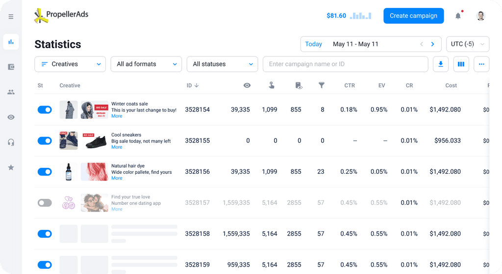
By improving information architecture we made the process of analysing campaigns’ metrics more efficient and got rid of information duplication within the system
Context
PropellerAds is an advertising network which allows to run advertising campaigns to both solo advertisers and big marketing companies. Around 5000 advertisers visit propellerads.advertisers.com every day to launch and optimize their campaigns.
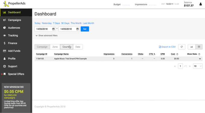
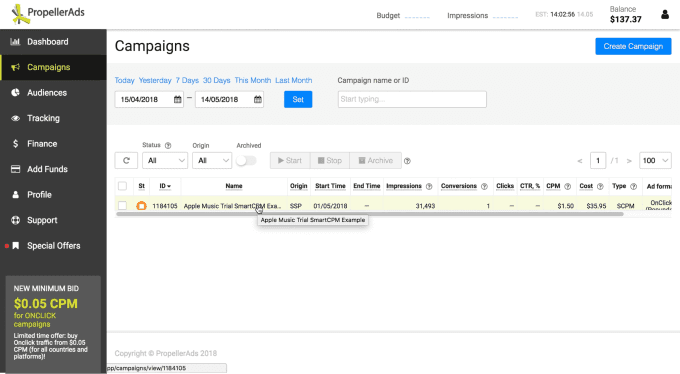
Dashboard vs Campaigns list сhallenge
Research
Qualitative data
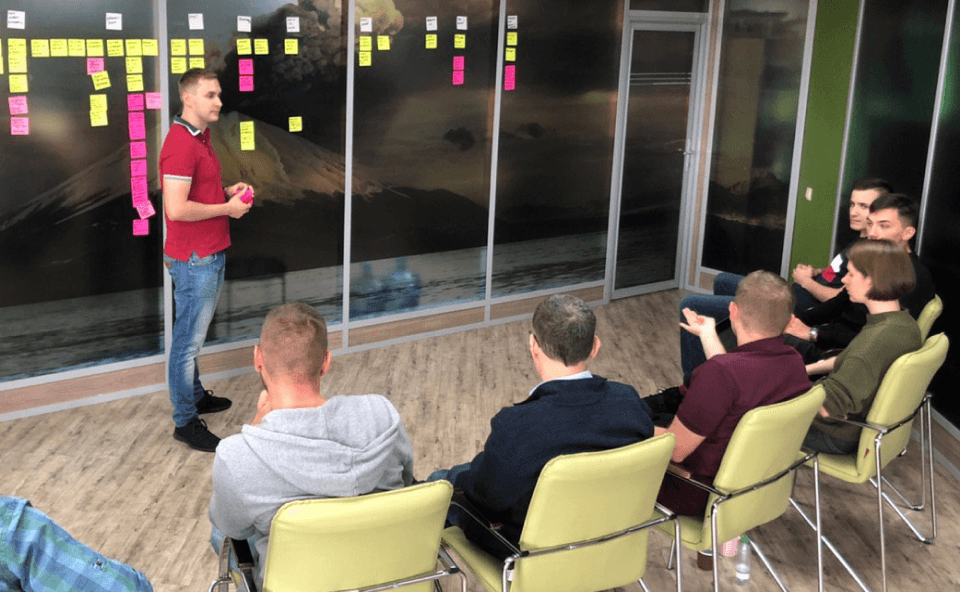
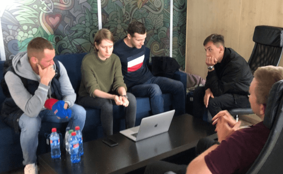
Our account managers helped us to organise 15 interviews with users from different segments. We also invited 5 advertisers to an offline workshop in our office to discuss their performance monitoring routine and collect feature requests.
Insights:
All users had to use the Campaigns list page
The Dashboard page was mostly used by users who formed their habits when the Campaigns list didn’t exist
All Dashboard users used detailed Zone’s statistics a lot
Detailed statistics for campaign’s targetings contained inaccuracies
Redesign plan
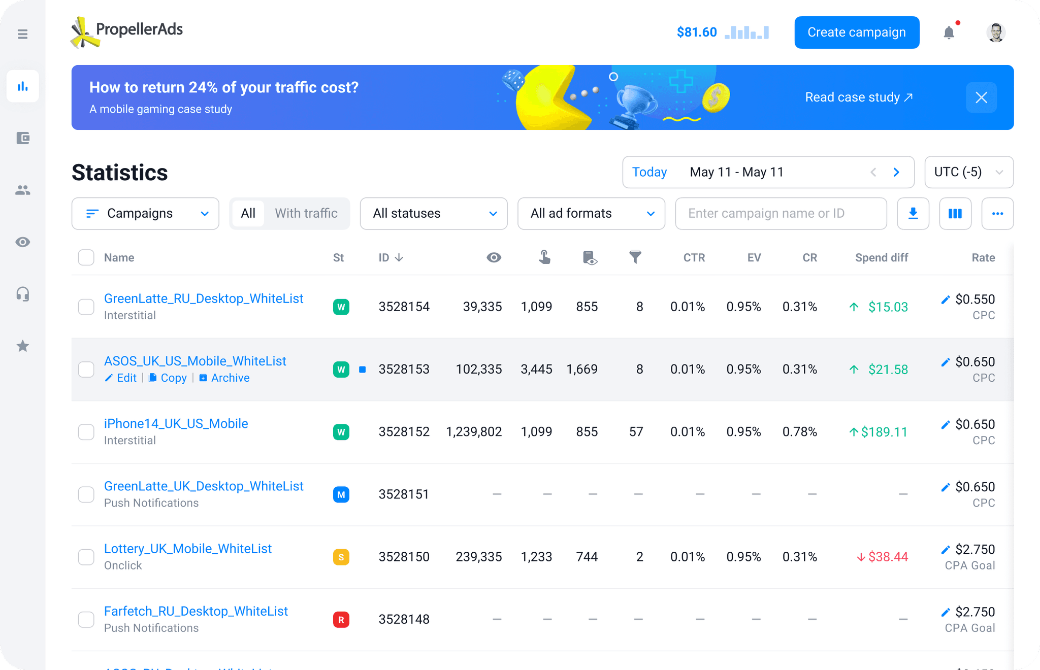
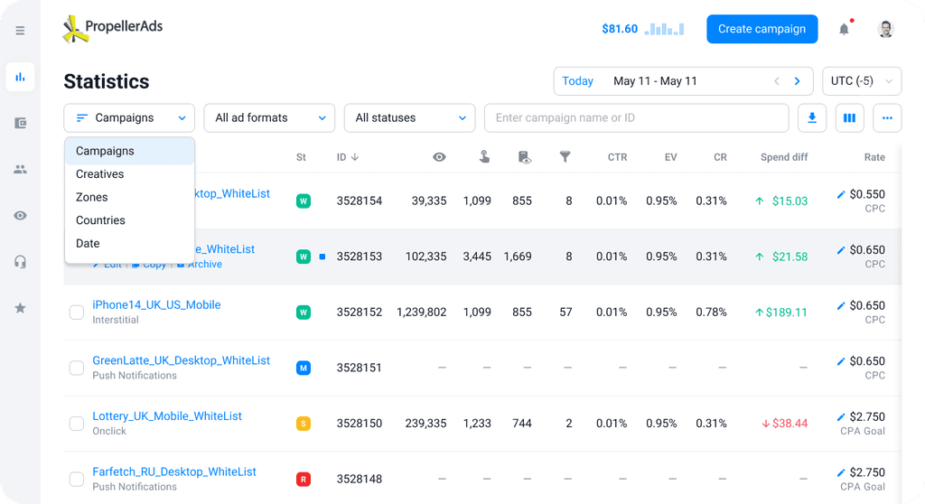
We decided to take the Campaigns list page as a basis, update it and add campaigns detailed statistics from the Dashboard page there.
We wanted to iteratively change UI with the final idea in mind, collect feedback and adapt our plans if needed. We also wanted to combine updates with adding requested features to reduce frustration related to changing habits.
Iteration 1: improvements of the Campaigns’ List’s
We optimized page layout to save space and fit more useful data:
Combined unsorted columns with others
Reduced filters area height
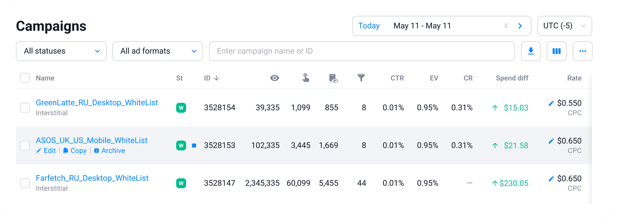
Changed long column names to recognisable icons to save space
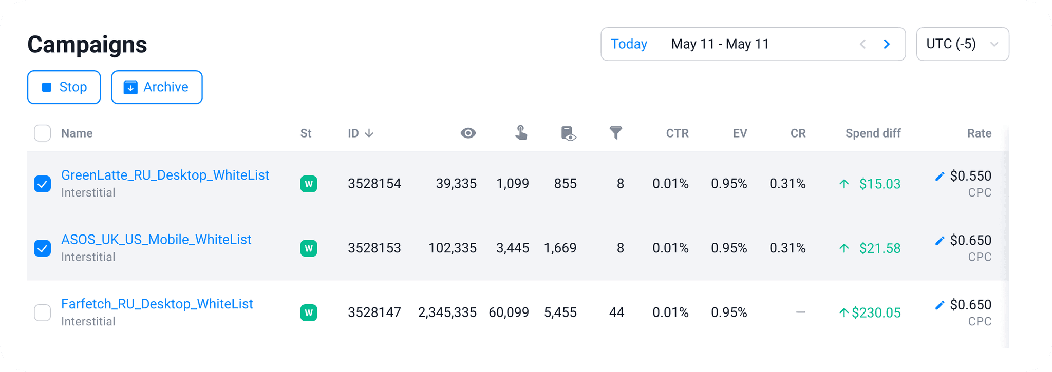
Moved actions to the left and made them appear on hover
We also added feature requests collected from users:
Time zones switcher
Possibility to customize columns
Profit and ROI columns
New time zones switcher quickly became one of the most frequently used filters, and icons instead of column names were spotted in competitor’s platforms later
Iteration 2: adding detailed statistics
The old Dashboard page used an expanded table to display detailed statistics for a campaign. My plan was to create a separate page for detailed statistics, so it would be more convenient to observe complex data.
We divided implementation of this complex page into small parts based on data presented. Our developers added one section per sprint, which allowed me to design in parallel. First pages were added without any promotion, but we still could see the number of visits growing.
Last transferred section was Zones statistics (most interactive and complex).
We combined its launch with adding new functionality and promoted it through marketing channels. It helped users to discover the new statistics page and increased adoption.
Final rollout (closing old Dashboard page)
The redesigned detailed statistics page was mostly visited by those who monitored campaigns performance on the Campaigns List page. They successfully adopted it, BUT as a new functionality.
However we still had a group of users, who monitored campaigns performance on the old Dashboard page, which we wanted to close. We prepared a plan to deal with unexpected circumstances and possible negative feedback:
Close the Dashboard page for all new joiners
Place a notification on the Dashboard page and inform old users about the closure date
Interview those who reacts to the notification
Close the section for all users with the ability to open it on demand
React to feedback, polish, open on demand
Close the section completely
Not everything went smoothly. When we closed the page for the first time, it turned out I missed one important thing. The old Dashboard only showed campaigns, which had data.
Users of the Campaigns List archived rejected or stopped campaigns, it was a regular ritual for them, so they didn’t complain about it during interviews.
This is where we added the last important update to the Campaigns list: a filter to show only campaigns with traffic.
After that we finally closed the old Dashboard page forever.
There was still a small percentage of negative feedback from our most conservative users, but after several weeks they stopped complaining to their account managers.
And interviewing new joiners showed us that they tended to use PropellerAds network only as they didn't feel the need to explore competitors.
Achievements
Our small team managed to make a significant update of the main user flow within a year. We implemented changes by small steps, smoothly changing users’ habits and constantly reacting to their feedback.
At the same time we were constantly delivering business features, thanks to effective tasks splitting.
We got rid of misleading duplication of scenarios and improved our application:
Percentage of users visiting detailed statistics increased from 12% to 32% and continued growing
Redesign of the performance tracking flow helped us to promote useful functionality, which were rarely discovered by users before
By getting rid of the old Dashboard page we improved the whole performance of the application and reduced tech debt (finally moved from Angular to React)
With all these updates we managed to fully move all parts of the system onto the new UI components library, which allowed us to easily apply visual updates across the platform
Contact me
ⓒ 2023 Veronika Galkina
